Portfolio Holdings
UX/UI Design, Mobile App Design
This case study focuses on improving the Portfolio Holdings page on Wealthsimple app where users review performance and manage multiple investments.

Wealthsimple
Portfolio Holdings
UX/UI Design, Mobile App Design
This case study focuses on improving the Portfolio Holdings page on Wealthsimple app where users review performance and manage multiple investments.


2025
UX/UI DESIGNER


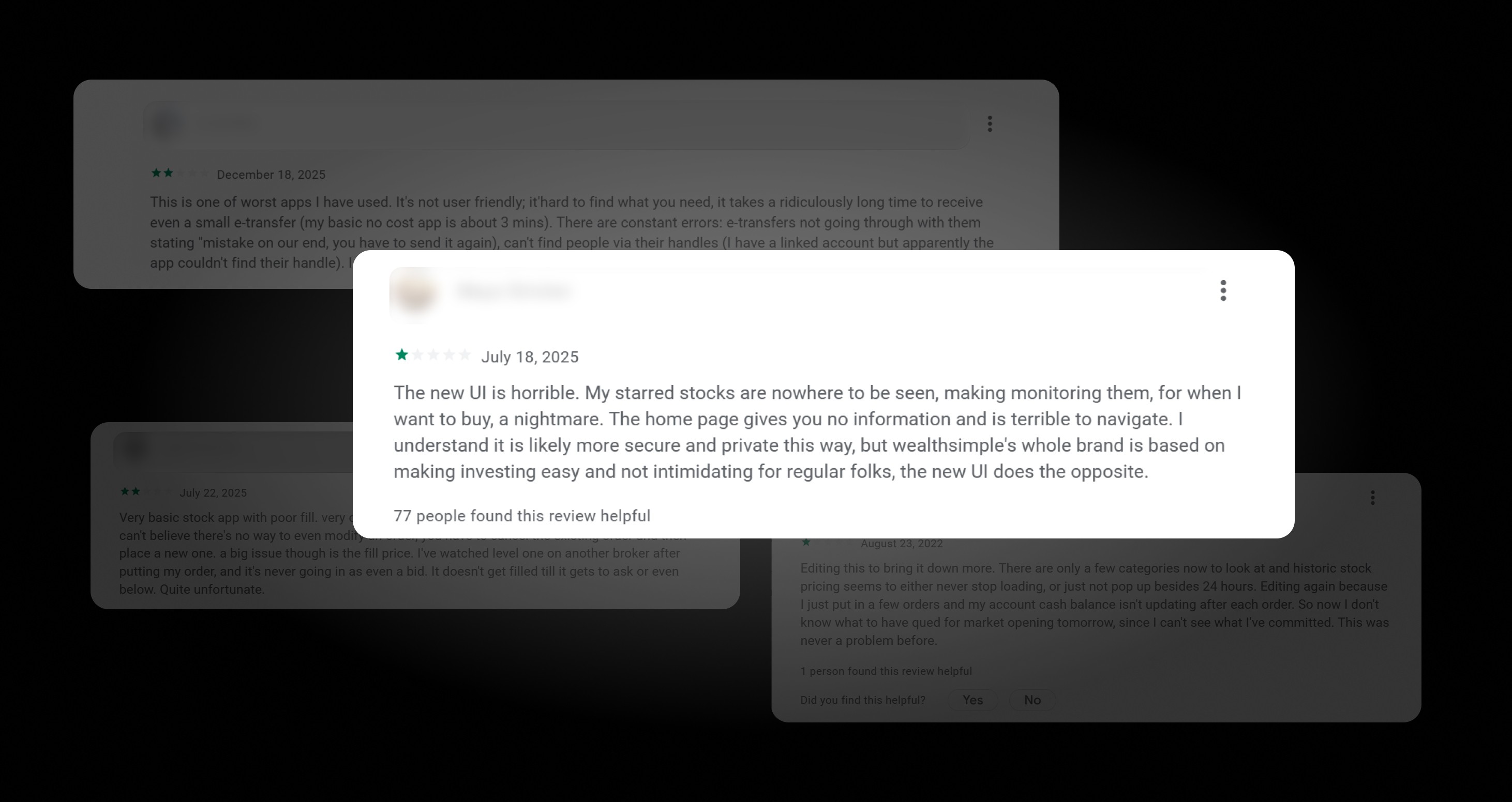
Wealthsimple's original design prioritized information density over information hierarchy. By burying key ownership data and performance metrics under promotional content, the UI failed to support the user’s primary goal: at-a-glance portfolio health checks.
I identified the following user challenges Wealthsimple users face currently.


Research revealed that frustrations spanned across experience levels, from first-time investors to power users.
The First Time User


Wealthsimple's whole brand is based on making investing easy for regular folks; the new UI does the opposite. It feels intimidating and clunky.
The Busy Professional

The home page gives you no information and is terrible to navigate. It takes a ridiculously long time to get into my accounts just to see my holdings.
The Power User

The new UI is horrible! My starred stocks are nowhere to be seen, making monitoring them for when I want to buy a nightmare.
Users struggle to quickly access and scan their holdings due to dense layouts
Important portfolio information is buried beneath secondary or promotional content
Both new and experienced users report feeling overwhelmed when checking portfolio health
Users want faster, at-a-glance reassurance rather than detailed analysis upfront
Weak Information Hierarchy - Important data competes visually, slowing down decision-making
Static Layout - Every asset is presented in locked vertical list, allowing no way for users to prioritize, collapse and compare.
Lack of Asset Focus - The assets growth and decline are visually hard to distinguish making it difficult for users to quickly identify.
High Cognitive Load - Users must process too much information at once to understand performance.
The issue was not the amount of data, but how it was structured. Presenting all portfolio information at the same visual weight forced users to process too much at once, leading to confusion and slower comprehension.
Iteration 01:
The initial audit of the Portfolio page design displayed a flat interactive model that forces users to navigate through a dense vertical stack.
Key Refinements:
Modular Information Architecture: I transitioned from a rigid vertical list to a chunked, card-based layout. This reduces cognitive load by allowing users to process assets individually rather than being overwhelmed by a dense data grid
Progressive Disclosure: I introduced an expanded state for active holdings. This uses the principle of progressive disclosure to keep the main UI clean while surfacing deep-dive metrics
Experimentation: During this stage, I experimented with replacing 'Share Count' with 'Portfolio Weight' (%) to see if it's more strategically valuable
Iteration 02:
While my iteration 1 experimented with 'Portfolio Weight' for a macro-financial view, I pivoted back to 'Share Count' in the final version. Through self-audit, I identified that ownership clarity is the primary mental model for retail investors, and surfacing shares directly reduces the mental math required for "at-a-glance" health checks.
Key Refinement:
The Pivot: I prioritized ownership by replacing the 'Weight' with 'Share Count'. For real investors to know how many units they own
Reducing cognitive load on the Holdings page directly supports Wealthsimple's core brand promise of making investing accessible
Faster portfolio health checks reduce user drop-off during the critical daily check-in habit
Shortly after this redesign, Wealthsimple shipped updates with similar information hierarchy patterns — validating the design direction independently