OCADU Student Portal


Accessible Accommodation

System for OCAD U's Portal

Accessible

Accommodation

System for OCAD U's

Portal

UX/UI Design, Website Design

OVERVIEW

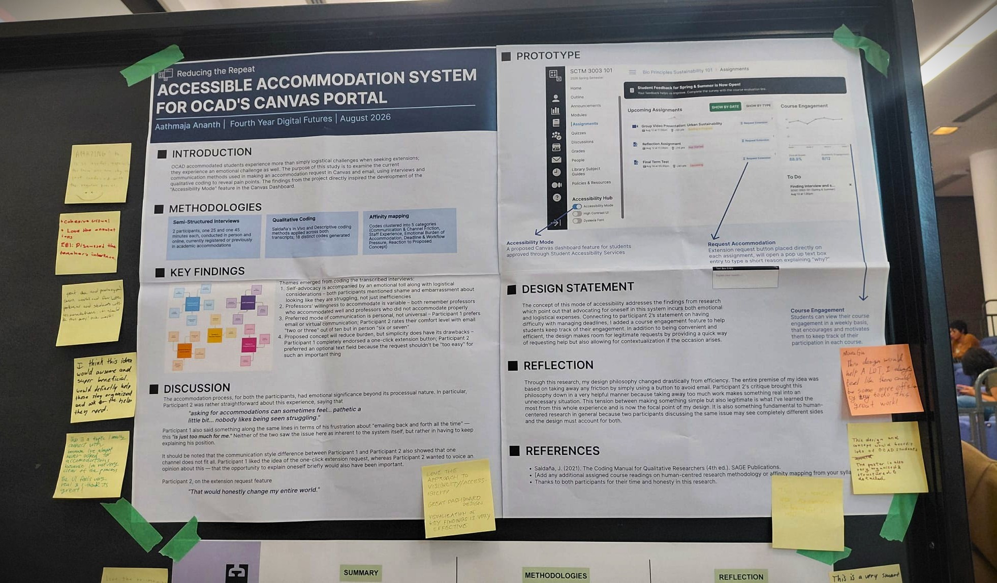
OCAD students receiving academic accommodations don't just deal with logistics when requesting an extension, they deal with an emotional toll. This project set out to understand why that process feels so heavy, and to design a concept that reduces the burden.


The research directly shaped a proposed "Accessibility Mode" for OCAD's Canvas dashboard.

YEAR

2026

ROLE

UX/UI DESIGNER

WEB DESIGNER

TOOLS

Problem Statement

Canvas's current design treats every student's path through deadlines and extensions the same way an email-based, one-off negotiation repeated every single time an accommodation is needed. For accommodated students, that repetition isn't just inconvenient. It's a recurring ask to explain, justify, and re-live a difficult situation.

Research & Methodologies
Research & Methodo-logies
  • Semi-structured interviews with 2 participants (25 and 45 minutes, one in person, one virtual) both currently or previously registered with academic accommodations

  • Qualitative coding using Saldaña's In Vivo and Descriptive coding methods across both transcripts (18 distinct codes generated)

  • Affinity mapping to cluster codes into 5 themes: Communication & Channel Friction, Staff Experience, Emotional Burden of Accommodation, Deadline & Workflow Pressure, and Reaction to Proposed Concept

Key Findings

1. Self-advocacy carries an emotional cost, not just a logistical one.

Both participants described shame and embarrassment tied to asking, not just friction in the process itself.

2. Professors' willingness to accommodate is inconsistent.

Both participants had at least one professor who handled accommodations well, and one who didn't — with no way to know in advance which they'd get.

3. There's no single "right" communication channel.

Participant 1 preferred email or virtual contact; Participant 2 rated their comfort explaining needs over email a 2–3 out of 10, versus a 6–7 in person. A one-size-fits-all channel doesn't serve everyone.

4. Simplicity has a limit.

Participant 1 fully endorsed a one-click extension button. Participant 2 pushed back — a request that important shouldn't be too easy, and wanted the option to explain why.


"Asking for accommodations can sometimes feel... pathetic a little bit… nobody likes being seen struggling." — Participant 2

Research to Design

The tension in finding #4 became the center of the whole concept: how do you remove friction without removing legitimacy?

Design response: "Accessibility Mode" (Canvas dashboard toggle)

Design response: "Accessibility Mode" (Canvas dashboard toggle)

  • A dashboard-level mode approved through Student Accessibility Services — no re-proving eligibility each time

  • A "Request Extension" button placed directly on each assignment, opening a short optional text field to explain why — splitting the difference between Participant 1's one-click preference and Participant 2's need for the request to still feel substantive

  • A weekly Course Engagement tracker, added in direct response to Participant 2's comments about struggling to manage deadlines — a lightweight, ongoing way to stay on top of workload rather than only reacting at crisis points

Design Trade-offs
  • Started from an efficiency-first premise — the whole idea was to remove friction with a single button.

  • Participant 2's pushback reframed that premise. Taking away too much of the process risked making something that felt real (and taken seriously) into something perfunctory.

  • Resolution: an optional reason field — low-friction by default, but with room to add weight to the request when the student wants to. This also meant the concept had to satisfy two people with genuinely different needs from the same feature, not just one "average" user.

Reflection

Through this research, my design philosophy changed drastically from efficiency. This tension between making something simple but also legitimate is what I've learned the most from this whole experience... two participants discussing the same issue may see completely different sides, and the design must account for both.


"This project is deeply personal to me. As a student who relies on academic accommodations myself, I’ve experienced the emotional and logistical challenges firsthand. Those experiences gave me a sharper understanding of user needs that often go unnoticed. During the poster discussion session, I received meaningful feedback that reinforced just how important and overlooked this topic is. It made me even more certain that designing for accessibility isn’t just about efficiency, it’s about addressing the emotional weight and vulnerability that come with asking for support."

"This project is deeply personal to me. As a student who relies on academic accommodations myself, I’ve experienced the emotional and logistical challenges firsthand. Those experiences gave me a sharper understanding of user needs that often go unnoticed. During the poster discussion session, I received meaningful feedback that reinforced just how important and overlooked this topic is. It made me even more certain that designing for accessibility isn’t just about efficiency, it’s about addressing the emotional weight and vulnerability that come with asking for support."

Future Improvements
Future Improvem-ents

Looking ahead, I plan to expand the system with a feature that allows students to upload their accommodation letter directly to their dashboard. This would streamline the renewal process each term, removing the need to repeatedly submit documentation and reducing unnecessary stress for students who already navigate complex accessibility barriers. This addition reflects the core goal of the project: making support not just available, but genuinely accessible.

©2026 Aathmaja Ananth, All rights reserved.

©2026 Aathmaja Ananth, All rights reserved.